The days of pinching and zooming in to view the details on a shrunken version of a desktop site on your mobile phone is now a thing of the past because, in 2015, Google rolled out a change to its algorithm to factor in a website’s mobile presence as a ranking signal.
Having a responsive design has become the main requirement for an optimal browsing experience-and a chance to improve your Google ranking and ultimately, your conversion rate.
Why You Should Switch to a Responsive Design
A website needs to be user-friendly when viewed on a smartphone. This is because mobile viewers now outnumber desktop viewers, plus society is now largely multi-screen, so it is essential for your site to be viewable across as many devices as possible. Not having a mobile-friendly design can cause your brand to lose out on leads and sales.
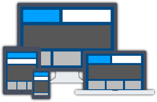
But what exactly does it mean to have a responsive design? Essentially, responsive design is one that automatically scales its content and elements to match the screen size on which it is viewed, preventing images from being larger than the screen width. This means that your visitors on mobile devices no longer need to do extra work to read your content, thus avoiding the unnecessary resizing, scrolling, zooming, or panning that they need to do on sites that have not been optimized for different devices.
The design also takes away the need to design a dedicated mobile website for smartphone users, so instead of designing multiple websites to fit different screen sizes, you can design just one site that automatically scales up or down to perfectly match the device it is being viewed on. It also has just one URL and one content source.
Design elements of responsive website design include readable text without requiring to zoom, adequate space for tap targets, no horizontal scrolling, and images that fit perfectly within the frame.
How a Responsive Web Design Can Benefit Your Business
Having a responsive web design enables you to increase your reach to customers and clients that view sites on smaller devices. It also lets you manage your website and your business more efficiently, since analytics, tracking, and reporting can all be done in one place, also minimizing the time and cost necessary for onsite content management.
Additionally, having a responsive design lets you make changes to your website quickly and easily, because you only need to do it on one website. This flexibility becomes a huge advantage when minimal tweaks are required, such as correcting a typo or making a quick design tweak on your site.
Finally, it all boils down to improved user experience, which is very crucial to website owners. You want people to have a convenient time browsing your site, and you want them to keep visiting your website. Having a professional Las Vegas-based web design company convert your existing website design into a responsive one ensures that your customers can view your content quicker and your product photos have the proper resolution, which means your site visitors will always find what they need and that they will keep coming back.